I want to talk a little bit about using historic material in type design. I’ve been thinking a lot about what it means to make ‘revivals’, how much it influences our view of type, and what lessons we can learn from historic material that ultimately have greater value than specific designs.
To be very very brief, and give away the whole talk: I’m looking at hero worship and craft as craft. I’m questioning historic survivor bias. And I’m looking into alternatives.
A curious person takes things apart, to see what makes them click. There are lots of things that we use every day, that we are completely used to, that we just accept. We don’t challenge or explore what those things are, or how they work, or why they work that way.
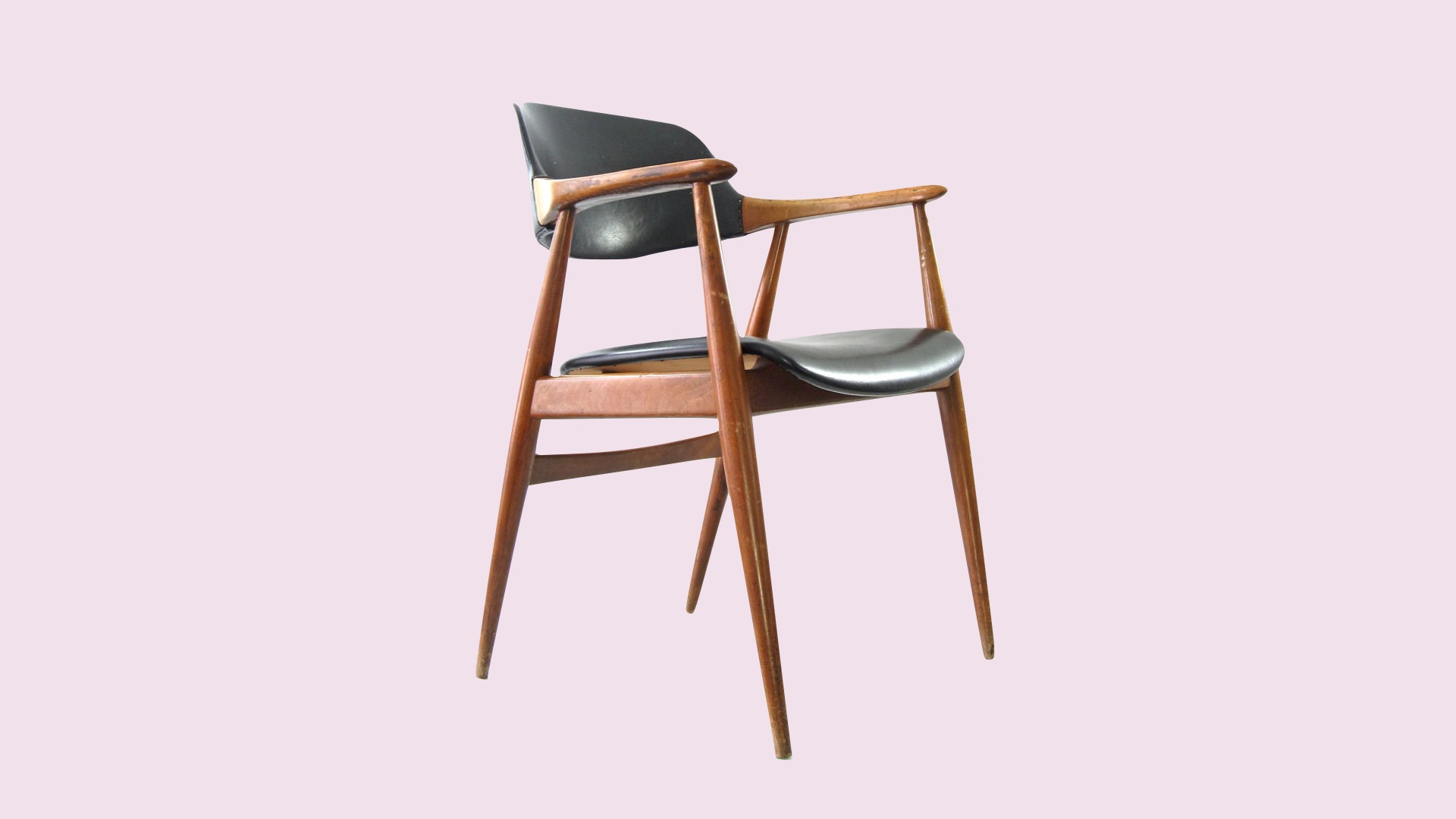
You can take apart alarm clocks, songs, or even chairs. You might not always be able to put them back together, but you’ll often learn a lot.
Revival as institution
Something I want to take apart is the way we use historic materials. Revivals are an institution in type design. We make copies of older designs for new media, and explore what the original shapes really were like. We also use this historic material as reference for quality, and as a baseline for certain ‘rules’.

Some of these rules have slowly developed and merged fully into our craft: rhythm, proportion, consistency. Influence of our tools on our work. Appropriateness to the medium. Gerrit Noordzij’s The Stroke provides a theory of type design that is entirely founded on the tools used to produce calligraphy and type.
That model abstracts away individual actors, and focuses on the methods and history of the forms, to the point that the evolution of our letterforms is only logical when you understand how they were created.

Frank Blokland’s research into formalised, unitised type design is equally based on the craft, rather than on a specific example that fits the model. He finds logic in the actual production of the metal type, rather than only in the more abstract design process. The production is the design.
And this goes way back. He finds these examples of unified widths in 1472, and this, in its own way, brings a deeper understanding to the history of the craft.
Particulars. Biases. Heroes
But we also have the things we call ‘revivals’. And what they are cursed with is baggage: the particulars of the originals, the consistent bias that history shows for certain kinds of people and certain works, and hero worship. There are several problems to discuss.
The particulars of the specific designs can distract from the design principles. When we call Garamond an old-style, or Renaissance typeface, there are certain expectations in the category language.
Formally, we expect relatively low stroke contrast, a contrast angle of about 30°, bracketed serifs, and capitals with varying widths.
When we however ask for a Garamond, or Garalde, as the category has also been called, we’re introducing a lot of complications. The works by his contemporaries, people like Guillaume le Bé, Pierre Haultin and Robert Granjon, were of the same category language, and these designers definitely knew of each other. They worked in the same field, on the same kind of products. To view Garamont’s work in isolation would not educate a type designer-to-be. Another known problem is that there is no authoritative, single reference Garamond typeface: for example, every design was made to a specific size. That’s the nature of lead type.
And in our eagerness to brand things with familiar names, a lot of type became called Garamond, including work by Jean Jannon, sixty years after Claude Garamont had died, which almost comically does not look like Garamond but which definitely became a Garamond in the eyes of typographers around the world. Even when we have a single reference design, it can be hard to say what really makes it what it is. The category was named after Garamond, but the contents within it are, very rarely, a singular Garamond. The differences become too great for it to bear the one name.
Survivor bias
Which leads us to the following conflict. The implicit survivor bias in the telling of history is damaging to the actual history of the craft.
Although we’ve largely corrected our historic records on who designed what, we did, for centuries, refer to Jannon’s work as Garamond, to Granjon’s italics as Garamond. This simplified version of history removes all the typefaces that didn’t make it, for whatever reason. Garamond worked during an incredibly busy period in type history, and we have to assume a lot of that history is lost. Lost for whatever reason – we simply can’t know. Lost, perhaps, because of an unfortunate bankruptcy, a bad reputation with the local powers, or simply used in books nobody deemed worth keeping. There is a risk of believing that only type that made it all the way to the here and now was the only type worth keeping – and that presumes a meritocracy that doesn’t actually exist.
Hero worship
Finally, hero worship creates a dramatically skewed image of type design history, where only a handful of individuals decided on the course of the craft.

Claude Garamont didn’t work alone in his foundry – no foundry where hot type alloy was melted was operated by one designer, punchcutter, matrix justifier, floor sweeper, lunch chef, and also a salesman. It asks for too much to believe that he worked alone. But as a consequence of his celebrity, what we primarily have is the idea that Garamont was a singular visionary who is the sole cause of the success of his work.
Hero worship also leads to unquestioning belief.
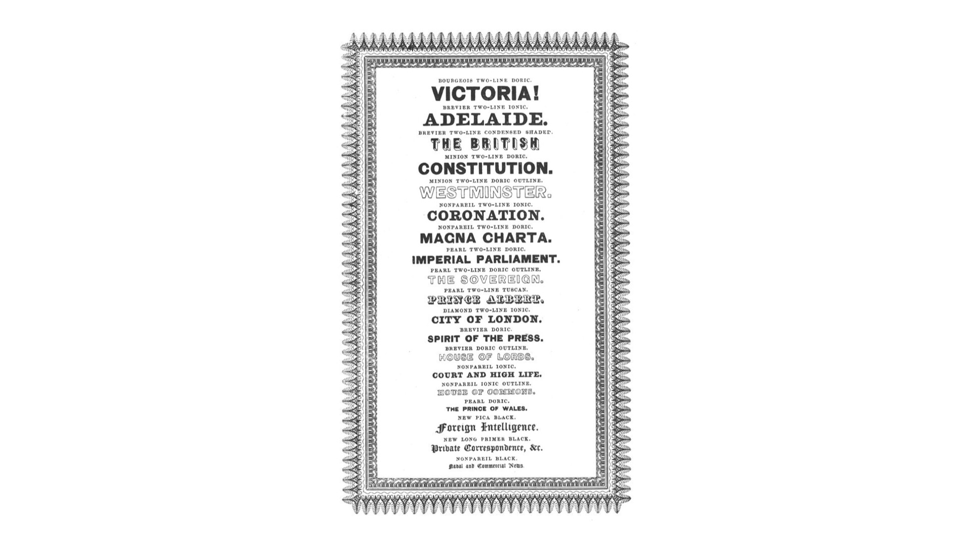
“When in doubt, use Caslon.”
This is of course an exaggerated example, and I don’t know any type designers who say this, but the idea that the name Caslon has become so strong, and so singular, is not based on merit but on celebrity. The various incarnations of the Caslon type foundries have had many, many type choices available for typographers, varying in purpose and quality, and a blanket statement like this ignores that complexity.
Lessons learned
So what did I learn from using historic sources?

For my own foundry, I currently only have historic references for sale. There’s a direct interpretation of some designs by Piet Zwart, from the 1930s, and there’s a broader translation of Haas Caslon paired with a sans-serif that references the same era. And in these projects, I learned a lot of things about the historic material I was interpreting.
This may be the moment you think, hey, isn’t she being a huge hypocrite? And… maybe? Maybe I am a hypocrite for being critical of revivals while having basically made a few. But I also believe that I got to this place of critique because of the revivals I made. There is a great value in revivals, the ones where you expose a design to a new medium, and of learning the internal language of that design.

Monumental Grotesk does things that Piet Zwart never planned or even imagined – such as the extended language support. And designing those entirely new shapes required a lot of puzzling and resolving, to understand the real idea behind the design.
In my eyes, the craft of type design is industrial design more than graphic design. Furniture making more than poster design. A chair, if we reduce it to its simplest purpose, only needs to keep our butt up. But we judge a chair for a lot more.
The quality with which one’s butt is kept up. The quality in which the chair fits the space it is placed in. The curves in the woodwork. The fabrics and the arm rests. And that sort of work, the craft of the furniture maker, ultimately is not predicated on having to look like other chairs in order to be a valid chair. There are certainly Platonic ideals, to some extent, that we seek to realise – category language is an amalgamation of more than just one piece of work, but rather the entire environment in which individual pieces can exist. A chaise longue will meaningfully differ from a dining chair.

Perhaps your ‘chair’ does end up looking a lot like this. I don’t know. It holds the butt up. But we can judge it for the craft you invested into it, and for the quality of the sitting, and we never need to compare it to other ‘chairs’.
Similarly, in type design, a high-contrast serif typeface with a vertical axis and pointed-pen contrast has its own category language. But just as we don’t need to compare every chaise longue to the LC4, designed by Le Corbusier, Pierre Jeanneret and Charlotte Perriand, we don’t need to compare every high-contrast serif with a category language from the 18th century only to Firmin Didot’s works.
To limit yourself to a ‘revival’ may even give a false sense of security: so long as I copy this surviving design, surely I am also copying its virtues. But that presumes a lot about the original, and teaches you nothing about the reason the design looked and worked like that in the first place.
❝Revival❞
Another thing I’ve become concerned with is the language we use. We call our projects revivals. Bringing designs back to life. It’s a funny choice of word. An implication, for example, that the original has died. That you are the Doctor Frankenstein who will somehow inject life into it. There is a strange claim to greatness in that. A greatness by association, maybe?
Or was it on its last breath? Did we rescue a design that was dying, by… redrawing it? Did that… save the life… of this font?
When a chair design is ‘revived’, people don’t call it that. In furniture, if you’re getting an Eames desk chair – you know, the very expensive ones – but at a really low price, what you’re often buying is a copy. Not a homage or a revival. Not a remix or a reinterpretation. And if you pretend that you came up with it, we call that a rip-off. There is honour in a cover band not pretending to be Led Zeppelin, AND Queen, AND The White Stripes.
What often happens, and this is a much more related framework in my opinion, is that an idea gets translated. It gets translated from one time, place, format, ideology, technology to another. And that, by definition, changes the thing. That’s the secret behind every translation: when you read a translation of a text, you now read the words from two writers. Every translation tries to make the original relevant to a new audience, in its own way, with its own agenda and its own needs.
Letting go
A lot of type education already largely works this way. It already centres a lot of the craft, and it can judge a log like a chair. What I’m proposing is that we finally let go of our heroes. We learn more from the environments they worked in, their influences, their collaborations, and the many advancements to the craft that have come since their time, than from their individual type designs, and that is ultimately the spirit of standing on the shoulders of giants. Not pretending to be that giant, or to copy it, but to embrace its role in your own growth.
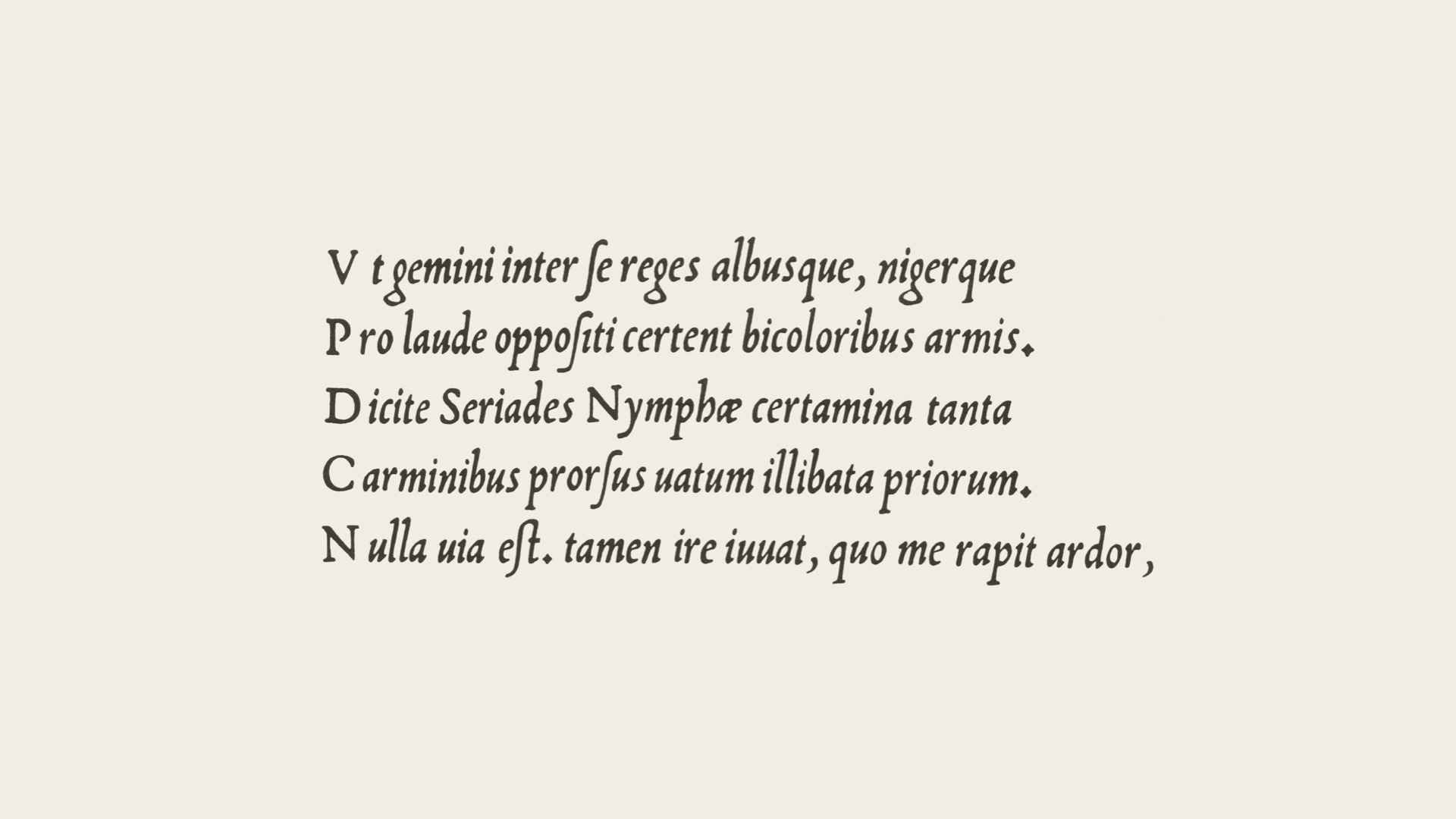
A way I’m exploring this myself is in the form of remixes and other experiments. One such example is a bridge I tried to build between 1450 and 1950. A jump across time and type styles.
When we learn about historic type, we can see certain ideas that maybe got lost to time. The upright capitals next to the cursive lowercase, in this Renaissance italic, very much in the tradition of Francesco Griffo if not in his work (which I’m not sure of), are a very interesting peculiarity. Over time this disappeared, but the appeal, to me, of a nice, tightly spaced lowercase, combined with these proud, wide capitals, felt like a wonderful pure idea that, if I understood it correctly, did not have to remain in the Renaissance.
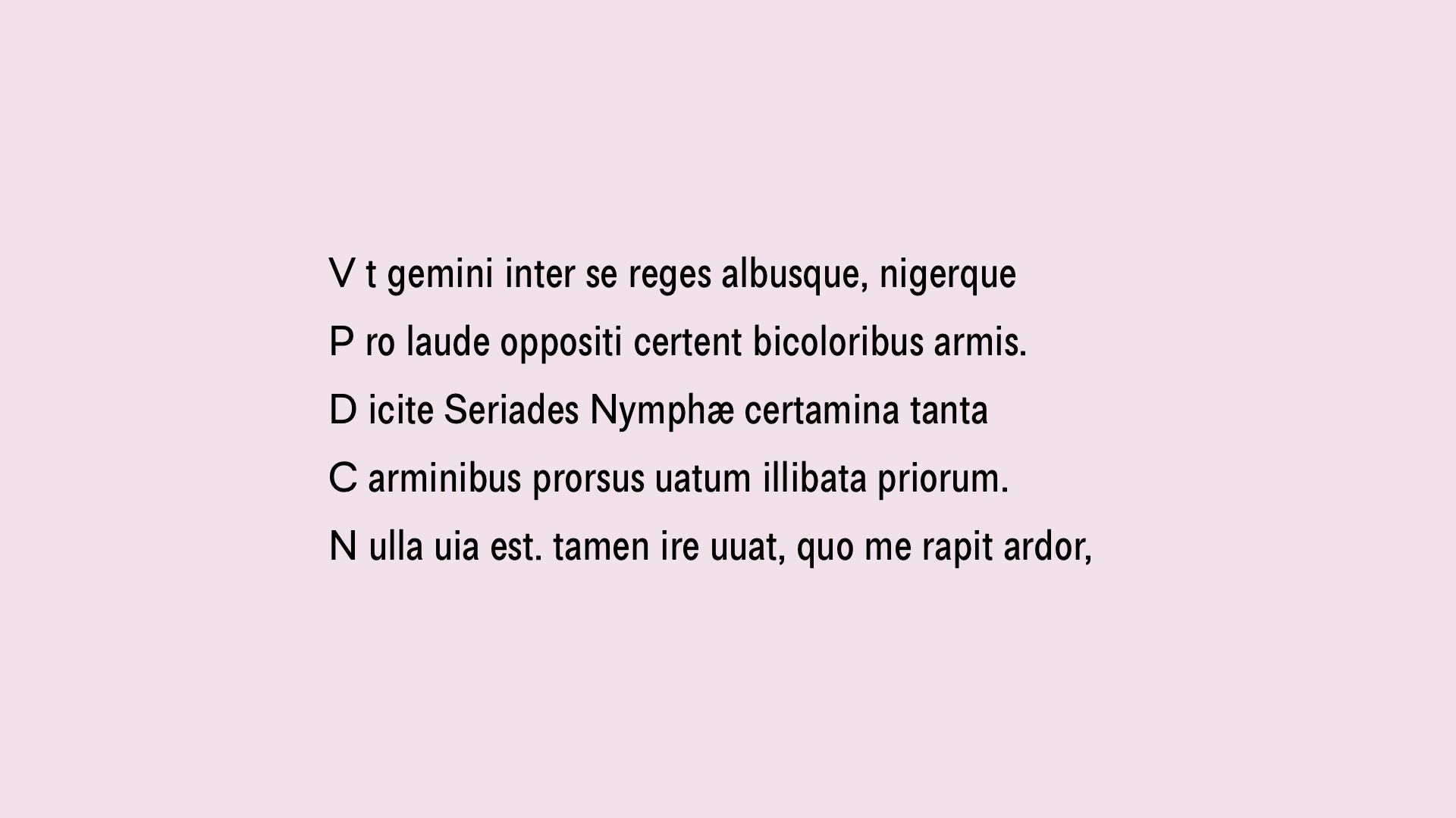
If we were to combine those shapes with a different era of forms all together, maybe, say, a quite rationalised grotesk from the mid-20th century, that should, in theory, still work. Rhythm, proportion, spacing: as long as those things are in place, a lot of doors close, sure, but some open up.
And I’m willing to say that it actually works. It’s fun. This is an outtake from the upcoming Tiny Grotesk. The final family ended up finding a different path, a better way to tell its own story. But the whole thing started with historic inspiration.
Another example is the sort of synthesis that happens in a creative process when you try to pay homage, when you try to speak a specific category language without imitating any particular exponent of that category language.
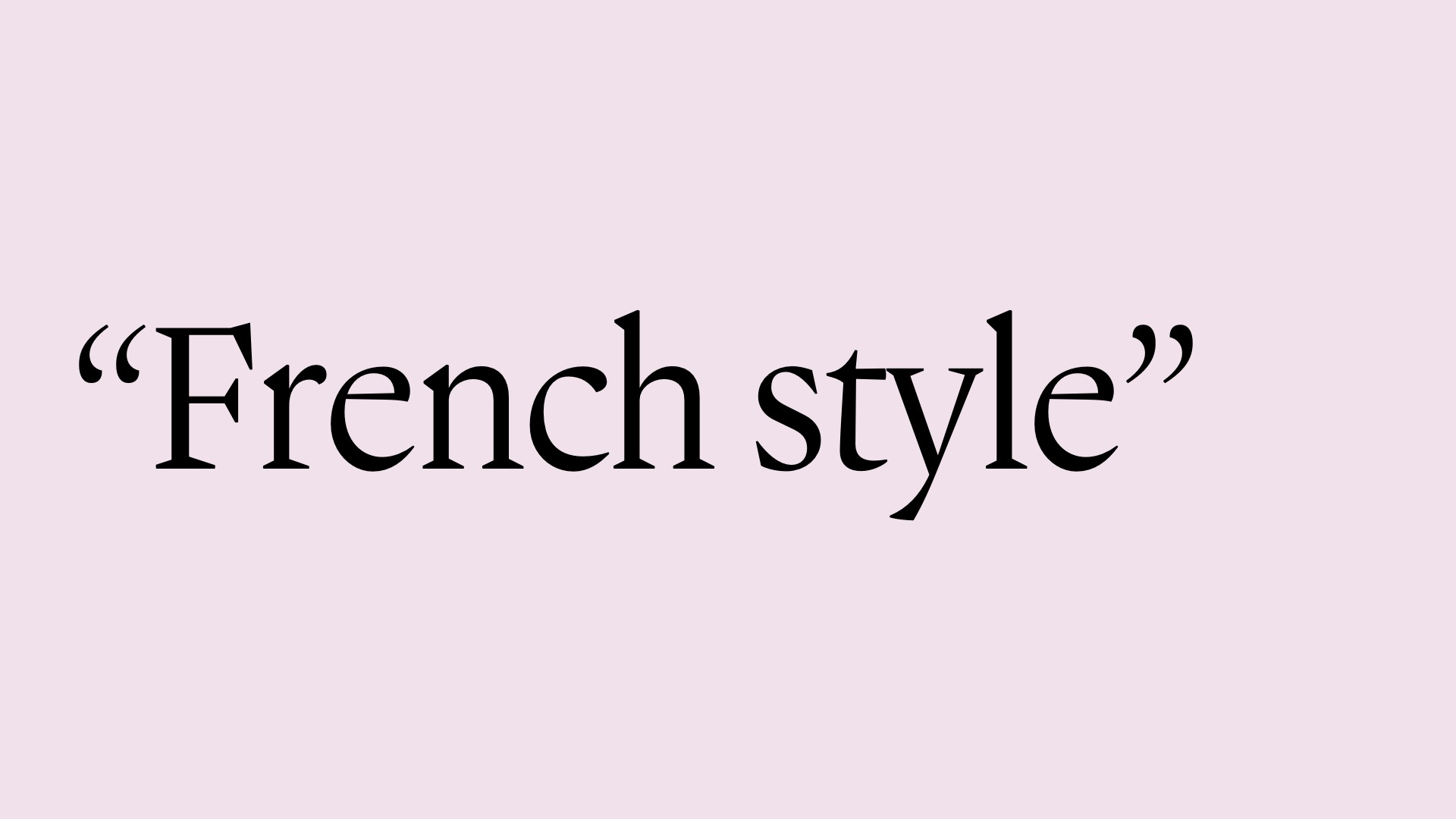
For example, this is Gagneur, a very poorly researched attempt at drawing a French Renaissance typeface from memory. I’ve referred to some drawings here and there when in doubt, but ultimately it looks like none of the sources I’ve gathered, sometimes complicating my job, but also, more often than not, opening up new possibilities.
Of course, there is a lot of unconscious work in this, a lot of inspiration I have absorbed over the years. But that isn’t invalidating. I think it is in fact quite exciting that something I drew from a gut feeling can feel so fitting to the category language. But maybe the right word for this isn’t a remix, a homage or an interpretation. Maybe this is a pastiche. Let me know down in the comments!
Taken apart
When I take apart a typeface, I can learn a lot. I look at what it is and what it does, and I look less at who it quotes. I see English transitional forms, I see Dutch crispness, and I see the new ideas that I felt necessary to make the design mine.
When I look at the “official” source for Dover Serif Text, I can still easily see where I started. But I think I took it somewhere else. I translated Edmund Thiele’s Haas Caslon, itself an interpretation of historical work. To me, it feels very different from more faithful digital takes on the original Caslons, such as Adobe Caslon.
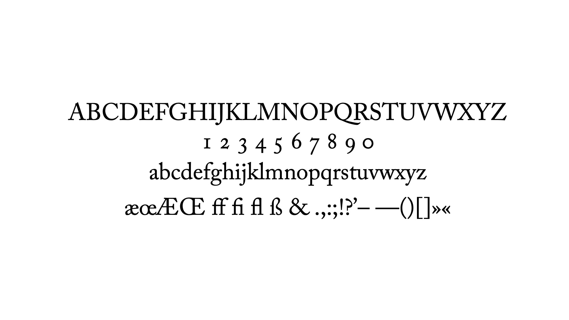
Adobe Caslon feels appropriately of the same age – a facsimile, or copy, or ‘digital version’, might be a better word for what this is. It leaves a very similar impression. The capital to lowercase proportion is also maintained, and it feels a bit poetic, perhaps.
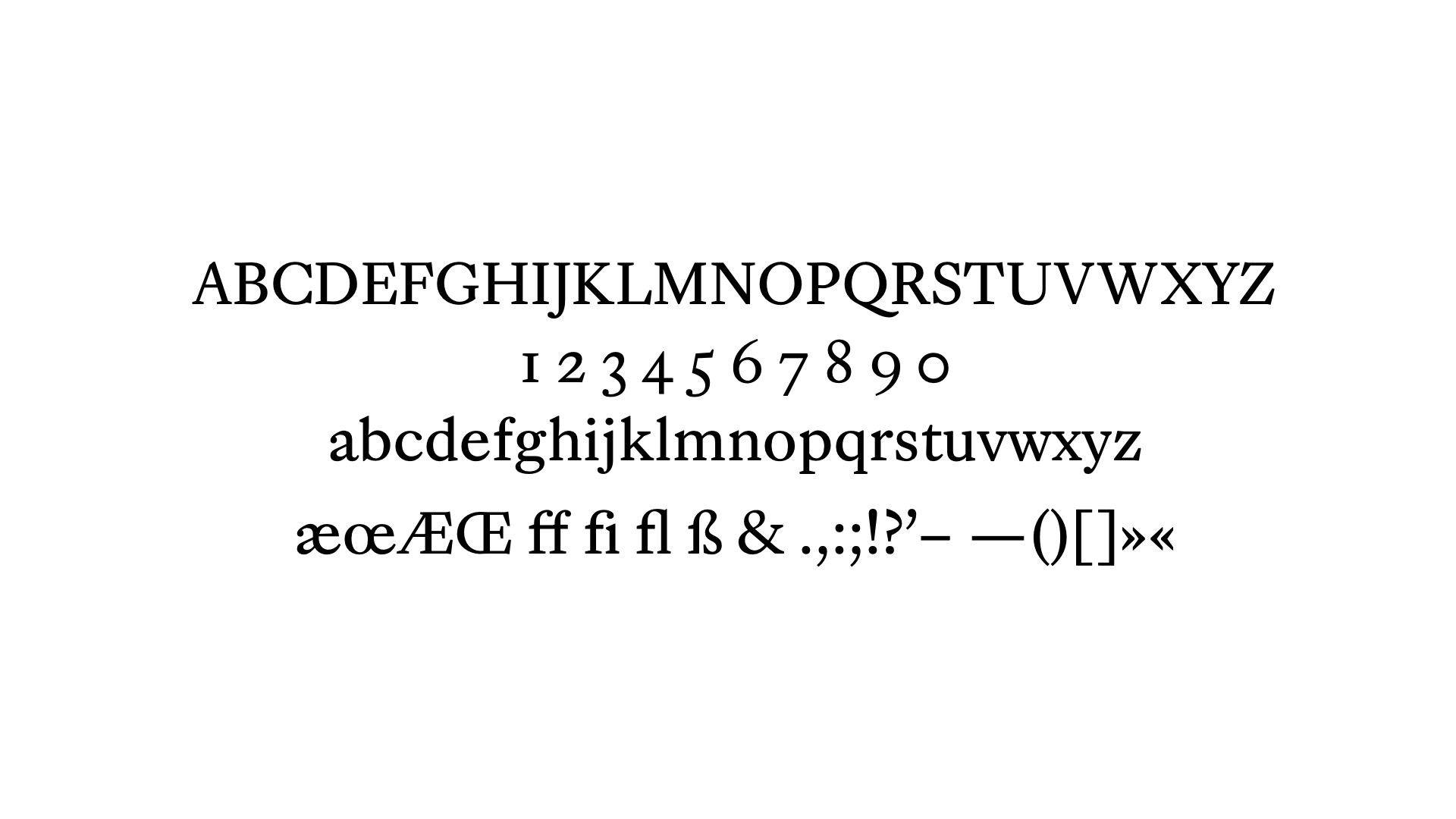
So when I go back to my reference, and I see what I took from the sources, I can sometimes lose the connection. I see so many places where I inserted myself, my needs, my expectations of what the Caslon category could do today. I made a lot of corners much more acute, I made the lowercase taller relative to the capitals, and I trimmed the length of the ascenders and descenders. It makes the face a little more matter-of-fact, a little less poetic. If those are the right words to describe what is ultimately my translation of someone’s translation.
I want to thank Indra, Amy, Sahar, Bianca and Tânia for making me do this, and then supporting me to do it too. I also want to thank Anna, who filmed the ATypI recording.
Robin Mientjes, 2020 (original publication)/2023 (text form)